Week 10 - Week 13 Typography : Final Project
8/11/2017 - 29/11/2017 Week 10 - Week 13
Wynne Pankusya [0333258]
Typography
Final Project Kinetic Typography
Lecture Notes
Week 11
No lecture.
Briefing for the final project and showing the posters of previous students.
Week 12
This week we are learning about indicating paragraph, highlighting text, and headlines between text.
Indicating Paragraph
1. Pilcrow
A hold over from medieval manuscripts but seldom used today. It usually used in early printed books. Pilcrow was used to make reading easier. This indicates a paragraph space which means moving to other paragraph but still in the same context eventhough with different argument (visual shift). Nevertheless, the disadvantage is that most people might not know about pilcrow. This is why the meaning of pilcrow should be mentioned before the writers start to begin a paragraph with pilcrow.
 |
| Img.1 Pilcrow |
2. Line Space (leading)
When people talks about line space/leading, it's the space between 2 paragraphs. If the linespace is 12pt, the paragraph space is 12pt. To get a cross alignment, the leading needs to be the same (12pt) or if it's more then you're supposed to double it (24pt, 36pt and so on). Even if you doubled it, it won't affect the cross alignment. Leading indicates the gap between line spaces while the line between ascender and descender is line space.
3. Create standard indentation
 |
| Img 1.2 Line spacing and Leading |
To create a standard indentation we are ought to use justify in order to make the sides of paragraphs not ragging an not having definition. Not to mention the uneven ends will make the column of text aren't alingned. However, we are not supposed to use indentation with line spacing.
4. Extended paragraph (creates unusual wide column of text)
Widow = Short line of type left alone at the end of a column
Orphan = Short line of type left alone at the start of new column
We need to avoid both of these in order to create a good paragraph. To decrease the widow there are some things that we could do such as increasing the number of words or create a bigger kerning. And for orphan, we could decrease the words or anything as long the context would still remain the same but without an orphan left out above the next column. To treat a body text ignorantly and not looking at it is wrong. A good designer need to apply everything that they have learned in any circumstances.
 |
| Img 1.3 Widow and Orphan |
1. With italic/bold
By using italic and bold we differently emphasize a word, If we wanted to highlight the text with italic, it would be fine if it's only few lines. Avoid using italics too much or it'd look odd. Reducing the point size of a bold text is important or the size will look more bigger than the other letters. To reduce it will make it match the x-height.
2. Changing the typeface / colour
If you want to change the typeface, change the kind of typeface differently than the one you're using. If you're using serif type on your writings, use sans serif for the words that you wanted to highlight. To highlight it with colour, if it's for website then any colour would be fne as long it's readable and legible. If it's for printing then you might not use any colour besides CMYK thus it'll avoid misprinting.
3. Highlight
Creating a background colour on the words. While highlighting the text with the certain colour, maintaiing the left reading axis of the text ensures readability at its best.
4. Bullets
By adding certain typographic elements outside the left margin of a column, it could maintain a strong reading axis.
5. Quotation Marks
Creating clear indentation and breaking the left reading axis.
 |
| Img 1.4 Quotation Marks |
Headlines between text
A head indicates a clear break between the topics within a section. This head is set larger than the text in small caps and in bold.B head is the subordinate to A heads. This head indicate a new supporting argument or example for the topic at hand. However they are not supposed to interrupt the text as strongly as A heads do. B heads are shown in small caps, italic, bold serif, and bold sans serif.
C heads, although not common, highlights spesific facets of material within B head text. The heads are shown in small caps, italics, serif bold, and sans serif bold. C head in this configuration followed by at least an em space for visual separation. C head located beside the actual text from a paragraph.
Week 13
No lecture.
Continuing the work and final submission for final project.
Instructions
Final Project
Final Project (Week 10 - Week 13) Kinetic Typography
Requirements :
- Sketches
- References
- Clear Binder Portfolio
- Adobe Illustrator
- Adobe Photoshop / Adobe Animate / Adobe After Effects
Week 11 - 12
Mr. Vinod mentioned before that we need to digitalize the poster of our font before this week thus he could give feedback. I did some sketches of how I wanted it to be with help of references. The more I found (references), the more ideas that come up from my mind. This is why I look for posters that have been made and shared in different platforms but mostly Pinterest.
 |
| Img 2 Ideas and rough sketches |
Name of the font 'Fuglitch' refers a combination of Futura font and glitch/distortion. The idea is to create a reflection of futuristic errors happening in computers. I wanted to make it looks glitch-y and also trippy where it would indicate the distortion of the font and at the same time sharing the meaning of it. The quote that I ended up using is "I see the future in glitch" as it also describes my font. To make it readable and distorted simultaneously is the challenge in creating the poster. I need to find the references thus I could imagine more on how I wanted the poster be.
 |
| Img 2.2 Reference for the colour |
 |
| Img 2.3 Reference for the composition |
 |
| Img 2.4 Reference for the design |
 |
| Img 2.5 Reference for the composition |
I searched typography posters to brainstorm the idea. I came up with four poster design in A4 that I'd like to use. Each of them shows different emphasis but still with the same main idea.
Img 2.6 Trial and error
|
Mr. Vinod said that the designs aren't 'glitch' enough. The second design fits the best and I have to make a new composition for it. Mr.Vinod helped a lot in creating the composition. A balanced composition but still showing the identity.
 |
| Img 2.7 Sketches of the composition |
I decided to create a grid to make it easier to put my composition. The form of the guidelines that I'm using is the rule of third. The goal is to make it the exact same as what I've made in the sketches.
 |
| Img 2.8 Bottom right is the final composition |
Week 13
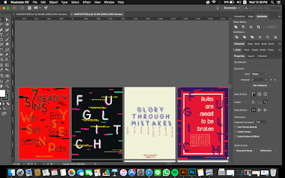
The next step is to start designing the poster. I'm using black background as the base in order to make the CMYK colours more pop out.
 |
| Img 3 Black background and white colour for the 'FUGLITCH' |
 |
| Img 3.2 I place the same sized 'FUGLITCH' letters but in magenta and cyan colour behind the white 'FUGLITCH' layer |
Since before the smaller words and letters that I put on previous design doesn't look divine enough, I decided to do more research to find the perfect design to put my letters and symbols. When I looked again at my design, I thought of digital coding. The green colour of it will be very significant and still on the same colour scheme with the colour of 'FUGLITCH'. The coding signify the futuristic and techno atmosphere on my poster.
 |
| Img 3.3 Digital coding rain from the movie poster 'Matrix' |
 |
| Img 3.4 Wrote all the letters, symbols and my name with coding rain design |
 |
| Img 3.5 added the glitch effect on it by creating lots of rectangles and squares with different colours (magenta, cyan, and grey) and sizes to make it even more 'glitchy' |
Img 3.6 Placing black rectangles and squares to make holes on the glitch and make it more resemble my font
|
After I'm done with my poster, I decided to create the animation with Adobe Photoshop. I saved my .Ai file into png in layers thus it would be easier when I wanted to create the subtle animation.
 |
| Img 3.7 Creating the animation by moving each layers every frame to create a glitch effect and slowly make the digital rain dropping |
Feedback
Week 11
Mr. Vinod said that the poster examples that I've made aren't "glitch enough" and I need to make the font looks even more stronger. Compositions need to be done before digitalizing it in order to brainstorm more ideas and well designed . However, the concept that I've made is acceptable enough
Week 12
The lecturers said that my animation and poster describes the font very well. The colours are nice, background fits it well. Mr.Shamsul said it looks "tech"-y which match the concept. The design and animation that I've made is a good example of expressing the font and well done.
Reflection
Experience
The whole thing happened in this project is the hardest challenge (yet) for me especially the fact that it's the final where it matters the most. To implement the past exercises, skills, and thoughts about how I am supposed to be in this project stressed me the most. Expectations from my lecturers also really affect me a lot means I have to be ready for whatever they wanted my results be.
Observation
This project is the ultimate conclusion of what I've learned this semester. Everthing that I've learned and not yet learned will appear in the process of creating or even can be seen from the result. I also realized that most of my designs aren't really strong eventhough I know what I want to do.
Findings
Composition is the key of a well designed artwork especially for typography project. I was a person who doesn't really care about it and have a mindset where I just create something that would look 'aesthetic' for me. I found that the more I searched for references, I could brainstorm ideas in creating the design.
Book of the week
Week 11 - 13
Williams, Jim, 2012, Type Matters!, Merrell Publishers Limited, London.
 |
| Img 5 Cover of the book |
Since I've learned about indicating paragraph on previous lecture, I wanted to read again about it to make sure that I've understand the meaning of it. The book showed different kinds of paragraph indication just like how It was explained by Mr.Vinod before.
 |
| Img 5.2 First and second page about indicating paragraph |
 |
| Img 5.3 Third and fourth |


Comments
Post a Comment