Week 8 - Week 10 Typography : Project two
25/10/2017 - 8/11/2017 Week 8 - Week 10
Wynne Pankusya [0333258]
Typography
Project 1 Font Design
Lecture Notes
Week 8
No lecture.
Started sketch for the font
Week 9
No lecture.
Creating the font using Adobe illustrator
Week 10
This week lecture is about kerning and letterspacing which we will use for our own font. To create a font, we are supposed to know what kind of font that we wanted to create. Either it's a display font or text font. Display font is the font that we mostly use as a display because it's too decorative. While the text font is the font with more restriction which leads to little characteristics on the font.
Img.1 Tracking and Kerning |
"We are reading pattern, not the letters"
Designers tend to letterspace uppercase letter but there has been resistance within the type communitiy to letterspace lowercase letters within text. Wordmark means very little space and a lot of kerning. We are to indentify what type should be loose or tight (even). Even means that the positive and negative area is stable. Great value means the eveness of positive and negative spaces. To add space for uppercase is a must to be readable. When the text font is designed, letters are purposed to be read. This is why before we create a font, we need to determine the use of it.
There are different kinds of formating text.
Flush left: A format which closely mirrors the asymmetrical experience of handwriting. Each line starts at the same point but ends wherever the last word on the line ends. Spaces between words are consistent throughout the text, allowing the type to create an even gray value.
Centered : Imposes symmetry upon the text, assigning equal value and weight to both ends of any line. Transform text into shapes and adding a pictorial quality to material that is non-pictorial by nature. It is important to amend line breaks in order to not appering jagged since it has a strong shape. This format should be used sparingly and not the whole body of the text just like invitation cards. Means that it is not suitable for books.
Flush right: Places emphasis on the end of line as opposed to its start. It can be useful where the relationship between text and image might be ambiguious without strong orientation to the right.
Justified : Imposes symmetrical shape on the text and it is achieved by expanding or reducing spaces between words or even letters. The result it could cause 'rivers' of white spaces. The good point size for justified format each line is around 60 to 55 which is the roughly number of characters that we should have everytime. If it less than that, there'll be huge holes (rivers).
Justified: Imposses a symmetrical shape on the text and it's done by expanding or reducing spaces between words and letters. This is why it resulting 'rivers' of white space running vertically through the text.
By understanding the format, this will helps us as designers to present author's message clearly. For instance the same message is written with 2 different kind of format. One of them is very decorative and another one is more formal. If the content is wedding invitation, eventhough both of the consist same messages there'll be different ways to digest it.
It's very important to understand different typefaces feel as atext. Different typefaces suit different messages. A good typographer has to know which typeface best suits the message at hand. Sensitivity to these differences in colour is fundamental for creating successful layouts.
Type size: The text type should be large enough to be read easily at arm length
Leading : The text that is set too lightly encourages vertical eye movement: a reader can easily loose his or her place.
Line length: Appropriate leading for text is as much a function of the line length as it is a question for type size and leading.
Instructions
Project 2
Project 2 (Week 8 - Week 10) Font Design
Requirements :
- Sketches
- A4 Green Graph Papers
- Clear Binder Portfolio
- Adobe Illustrator
- Font Lab Studio
Week 8
This week, after Mr.Vinod gave the brief about starting the font design, we are supposed to begin sketching for our own font. I searched for references and I used Futura font as the base which I'll be using when I wanted to create the thick and thin strokes. I tried to create different kinds of fonts and ended up using glitch fonts as my reference.
 |
| Img 2 Font reference |
 |
| Img 2.2 Font reference |
 |
| Img 2.3 Font reference |
 |
| Img 2.4 Sketches |
Mr.Vinod said that my first sketches of desired font might be potrayed as a usual font which facing problem with the printing (like an actual glitch). Thus he sketched the design for my glitch font and I finalized it. At first the font have two glitch on each side, but I've changed it and it only have a glitch on one side only which is the stem if the letter has it or the bowl part if it doesn't have.
 |
| Img 2.5 Final sketch of the letters |
Week 9
Allegedly, we supposed to be done digitalizing the uppercase, lowercase and numeral to Adobe Illustrator. The size should be 1000pt x 1000pt. We are working with points since it's a project to create a font. The x-height would be 500pt and the ascender and descender should be at least half of the x-height or more as long as it doesn't look too weird. The cap height should be a little lower than the ascender. Firstly, I need to create the strokes without any details. When I'm done, I could cut unwanted parts and create a hole to put my glitch effect. The strokes need to be changed into outline strokes thus it became a fill. When we changed it into fill, we can adjust more the thin and thick strokes. But we need to keep in mind that we need to save the strokes since anything might happened with the fill or wrong size of the font and we can't really edit it.
 |
| Img 3 Process of creating the font in Adobe Illustrator |
 |
| Img 3.2 How the font would look like when it's changed into outline strokes (using command+y to look at the outline) |
 |
| Img 3.3 The result. We have to combined all the glyphs together in order to know if our font is consistent enough |
Week 10
After all the letters are approved, I need to transfer all the glyphs to Fontlab Studio. The x-height, ascender and descender need to be adjusted before we move all the glyphs.
 |
| Img 4 Transferring all the glyphs |
Week 11
Before generating the fonts from Fontlab Studio, I need to open the metrics window to see if my letters look good when I type some words.
 |
| Img 5 Typing words after adjusting the tracking |
Week 8
General Feedback: We are supposed to post the project 1 assignment in our blog based on what Mr.Vinod wanted. For the artboard we will use for the font, the size will be 1000x1000 pt. The x-height supposed to be 500pt (the ascender and descender could be 250pt or more depends on your font but nothing too much). We are supposed to change the unit into points as it's a project to make a font.
Spesific Feedback : the animation is relatively good, but there are some minor problems regarding to the speed of each animation. Some of the animation aren’t strong enough to express the word. means that i need to fix some parts. The font that I made is quite interesting but the effect that I’ve made might be mistaken as a print glitch. Thus, Mr.Vinod create the same style of my font but he modify a litttle bit. The design of the font is not supposed to be too overwhelming. If I already have a certain strong parts, I’m shouldn’t add more particular unique parts.
Week 9
General Feedback : The letters, numerals and punctuations need to be digitized this week since next week is the deadline. We also need to be careful when creating the strokes and do outline strokes when we're done (to shape it). The blog needs to be updated after feedbacks that was given.
Spesific Feedback : My blog needs to have lines in order to separate each part to be neater. Thumbnails need to be uploaded to the blog for Mr.Babadook. When I took photos, tthe background of the photo must not be black or white. If the design of my font have a lot of details, it will become too much. Each circural strokes of a letter isn't supposed to have the same size. Some parts that's near the stem have to be slightly thinner just like how most fonts are.
General Feedback: Kerning and Letterspacing are two different things and we need to learn that in order to create a font. Next week we have to print the final fonts from illustrator.
Spesific feedback : In general if I wanted to create a font, i have to put all of the lowercases, uppercases and numerals together and see it as a whole then I could see if there are changes throughout creating my own font. Some of the letters doesn’t have the same composition ended up looking different. The letter A that I created might look the same from A letter of Futura but mine is not as wide as the futura font and it look weird eventhough the tip of it look the same.
Week 11
General Feedback : We are supposed to submit the project today or it would be considered late.
Spesific Feedback : The bearing on the left should be 0 in order to create a standard bearing to every letters and numerals thus I could re-adjust them later to make the kerning and letterspacing neat. There are some minor mistakes after I generate the fonts. Some symbols are too small and the lowercase 'n' letter doesn't look like it's in the family since the size is slightly smaller than others. Some letters look weird since I have to create the same detail to every font.
Reflection
1. Experience
Week 9 : To create a font with illustrator isn't as easy as sketching it. Resulting odd looking font. Especially since my font is hard to work with (because of the details)
Week 10 : To maintain the consistency of every single letter isn't an easy challenge
Week 11 : Struggling with the letterspacing and kerning when it's transferred to Font Lab2. Observation
Week 9 : With the details that I've made, I could conclude that my font is designed for display
Week 10 : Comparing the font that I've made and font reference helped me a lot when it goes to creating thin and thick strokes
Week 11 : Managing the size of each letters very necessary since it will impact the result when you type words with the font
3. Findings
Week 9 : Thick and thin of a font might not significantly show differences, but it actually have a big impact
Week 10 : Composition of the letters need to be the same or else it would ended up looking like another different font.
Week 11 : When it goes to letterspacing and kerning, A letter that stand by itself might look differently than when you type all the letters together. This is why tracking is important
Book of the Week
Week 8 - Week 9
Gosse, Joke, 2014, Tasty Stories Legendary Food Brands and Their Typefaces, Luster, Antwerp.
A strong visual identity is what makes a brand extremely popular and iconic. It's a great advantage for every brands in food industry in order to keep the brand goes on in a long term and unforgettable. It's explained in the book on how the visual identities changed over the years giving an impact to the growth of the product.
 |
| Img 6 Cover of the book |
 |
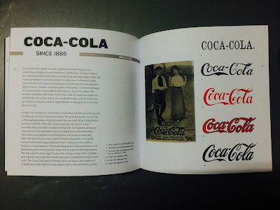
| Img 6.2 First and second page about Coca-Cola |
 |
| Img 6.3 Third and fourth page about Coca- Cola |
I read about how coca-cola became a global icon despite it's only a soda brand. It's easy to identify coca-cola logo. Coca-cola has not stopped expanding and has become the most popular drinkin many countries across the globe. When it was first started, the name was just typeset in chunky slab serif capital letters to distinguish it from plain text. In 1887, An alternative look was created in flowing Spncerian script which is a style that was used in US. The handwriting style is characterized by oval letterforms with an even parallel slope and an overall skillful appearance.
The logo that we know today was desined in the early 1940s. The letterforms were reshaped, for example the thin parts of the curved letters gained some weight which reduced the contrast and made the logo more legible in smaller size. The strength of coca-cola logo is that it has strong roots in the time when the product was invented and it's hardly changed over the years meaning it became an iconic logo till today. What I've learnt is that creating a type for branding need to go through steps if we wanted to make it remarkable. In order to do that, we are supposed to learn more about different kinds of typeset.
Week 10
Ambrose, G. & Harri, P., 2006, The Fundamentals of Typography, Switzerland, AVA Publishing SA.
This is a book which covered the introduction to the history of typography which really helps when we wanted to go deep into typography.
 |
| Img 7 Cover of the book |
 |
| Img 7.2 Topic about x-height |


Comments
Post a Comment